Schibsted — 01
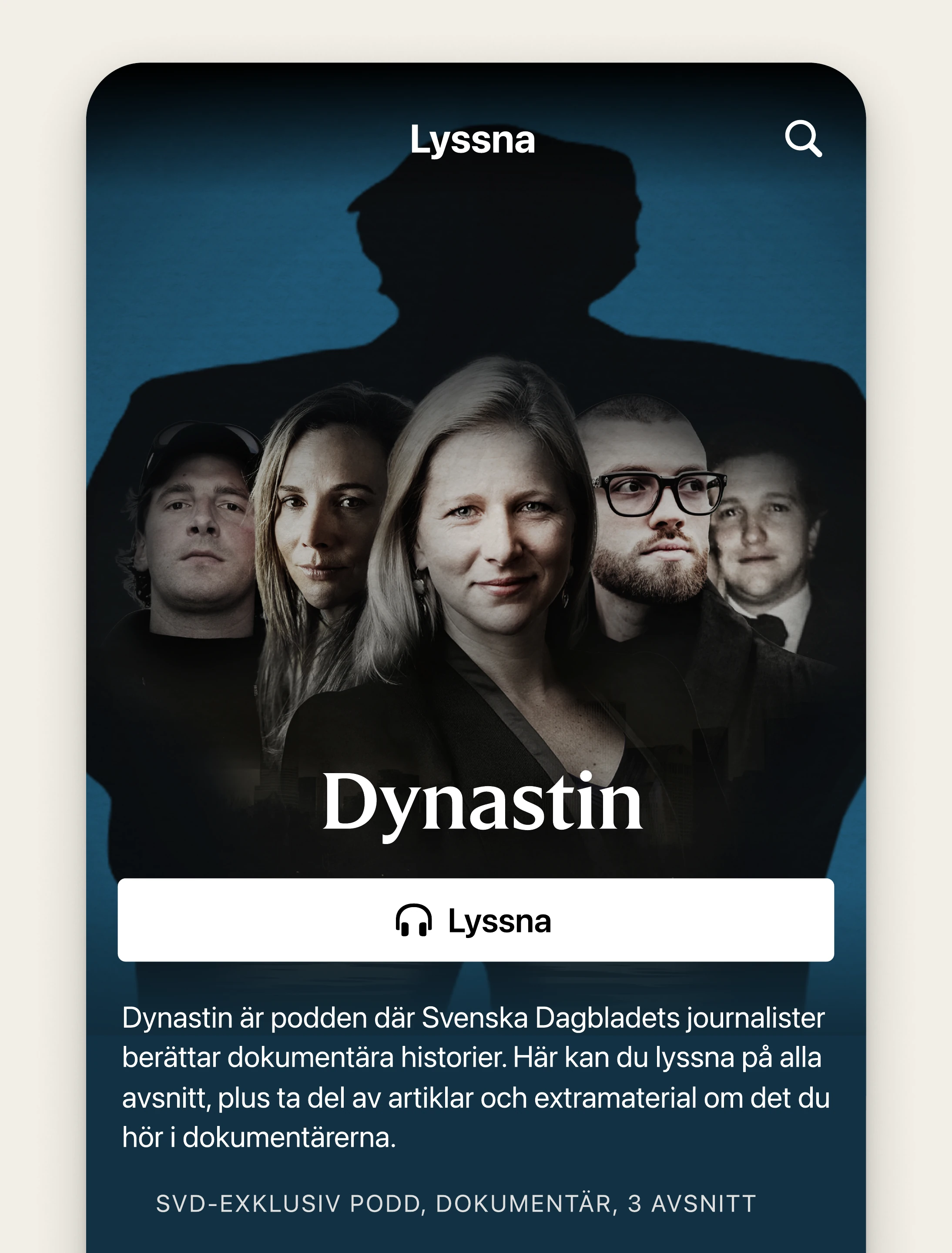
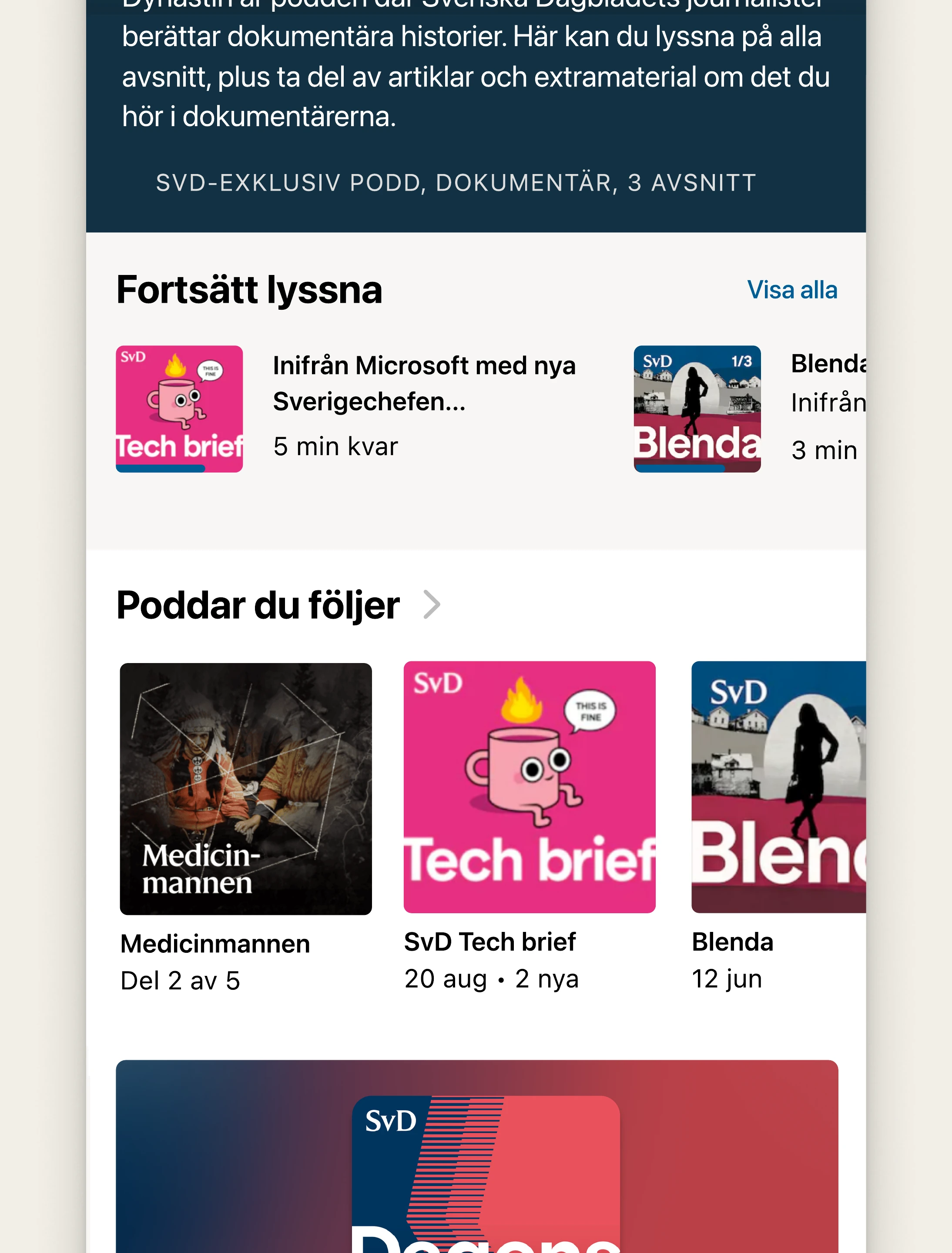
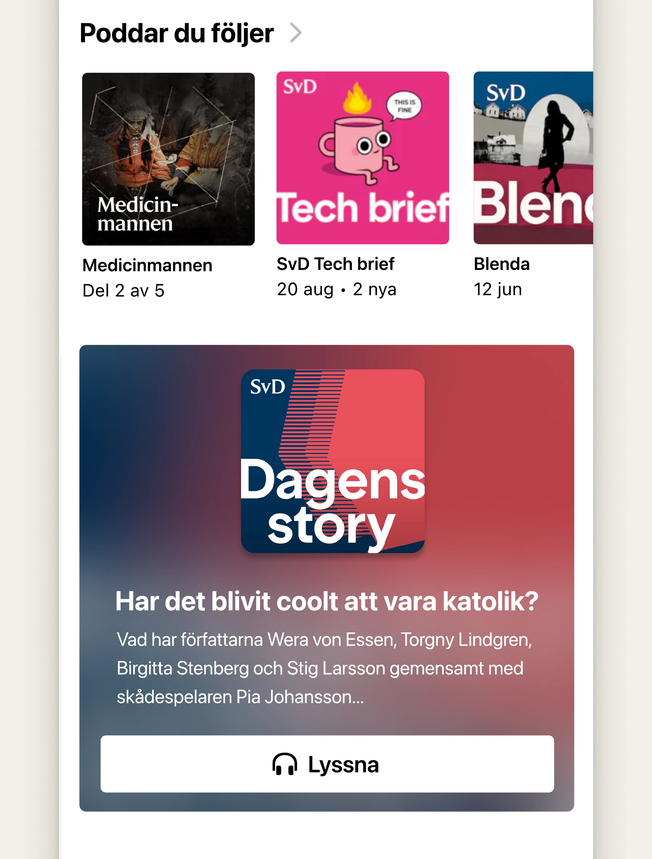
Podcast section for Svenska dagbladet
I am a visual and UX designer with over 25 years of experience in digital design, spanning design agencies, consulting firms, and product companies.
I am passionate about creating effective, user-centered solutions through workshops, user interviews, and testing.
Transcribing podcasts not only enhances accessibility but also improves discoverability, allowing users to search for specific topics or subjects more effectively.
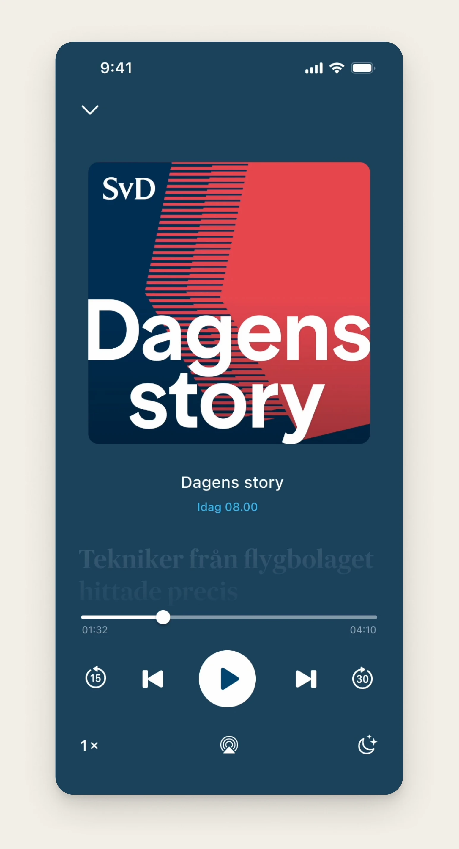
Research has shown that users want to read and engage in discussions about our podcasts. By integrating a comment section directly into the player, users can seamlessly read and write comments while listening, enhancing interaction and engagement.
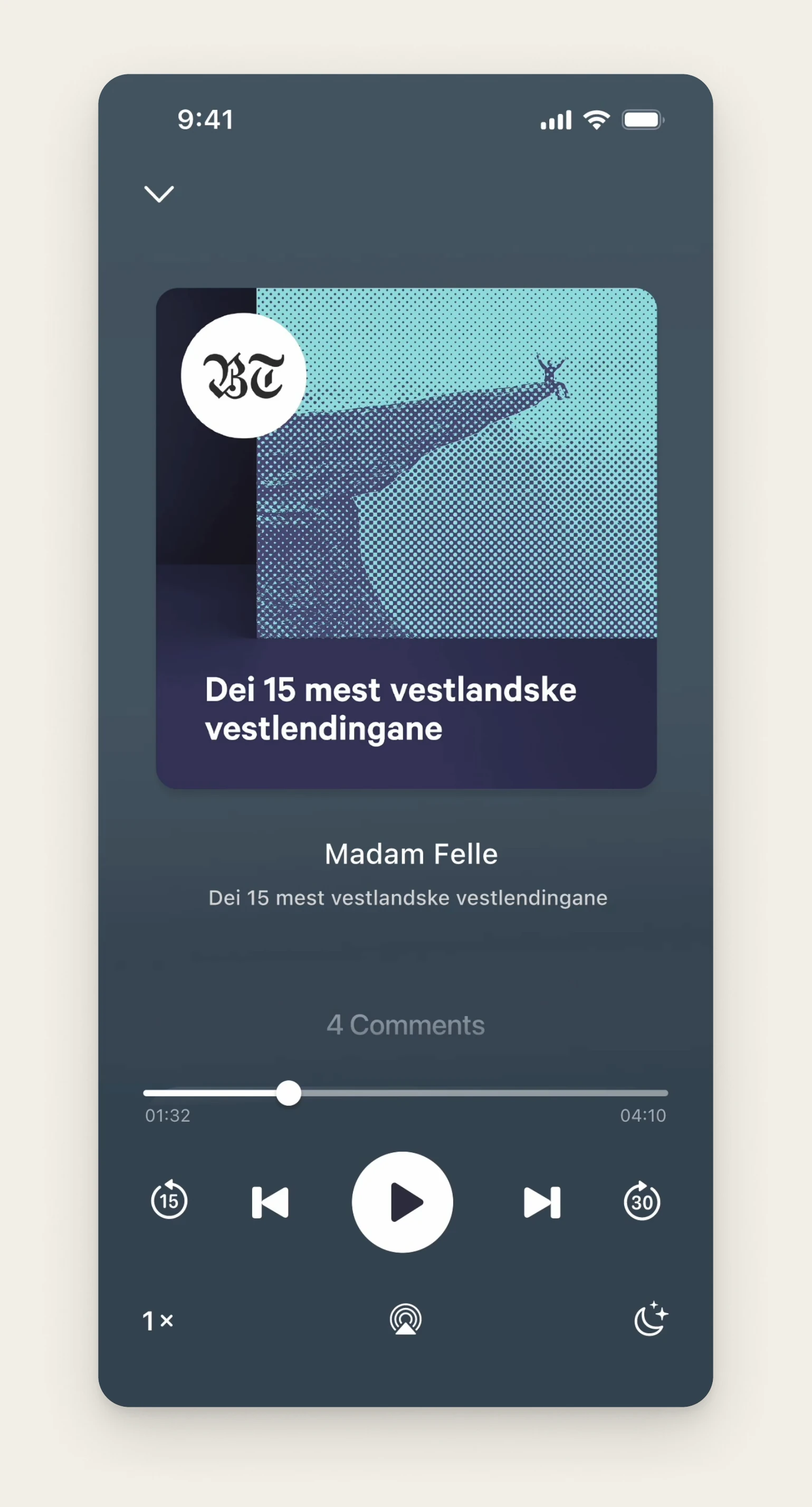
Schibsted has a vast image database featuring photos from around the world. Research shows that users want a more visual experience when engaging with podcasts.
This concept integrates images into the player, appearing at specific time cues to enhance storytelling and provide deeper context.
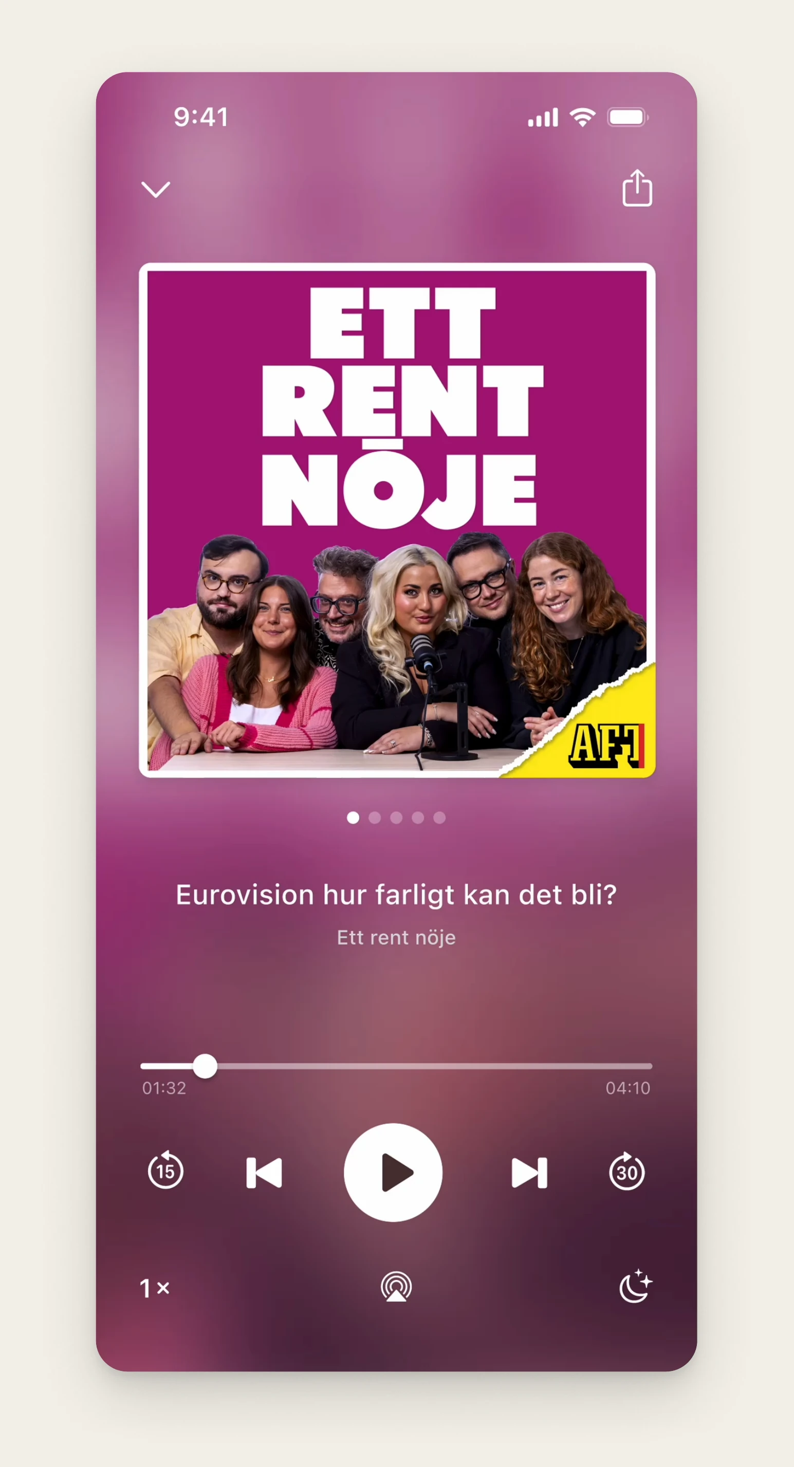
Currently, our video and audio podcasts exist in separate sections of the app, creating a fragmented experience.
This concept brings them together into a single player, allowing users to seamlessly switch between watching and listening based on their preference.
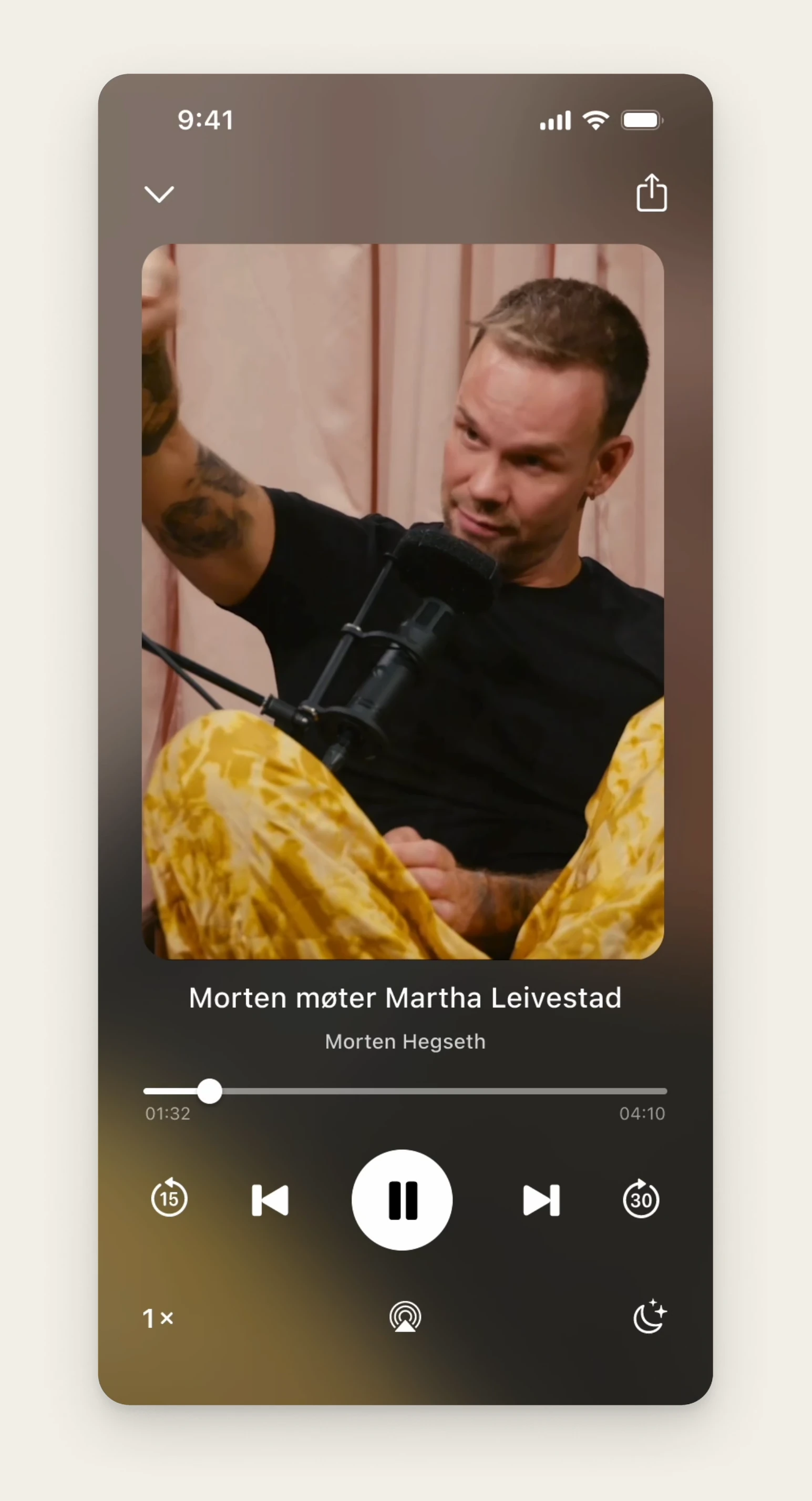
Transcribing podcasts not only enhances accessibility but also improves discoverability, allowing users to search for specific topics or subjects more effectively.
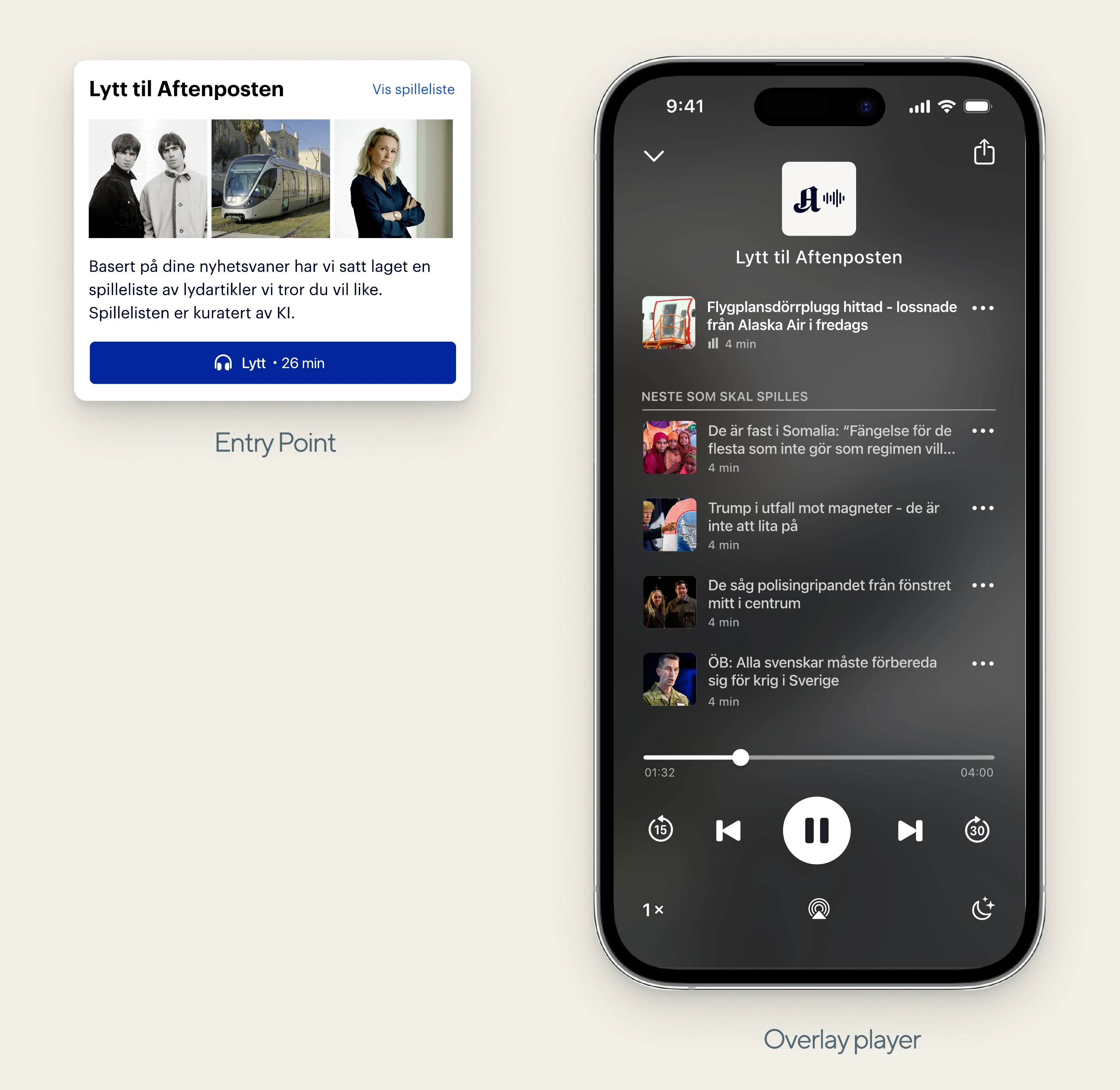
We recognize that users often prefer listening to the news. To improve this experience, I designed a player that curates a personalized playlist based on their data and preferences
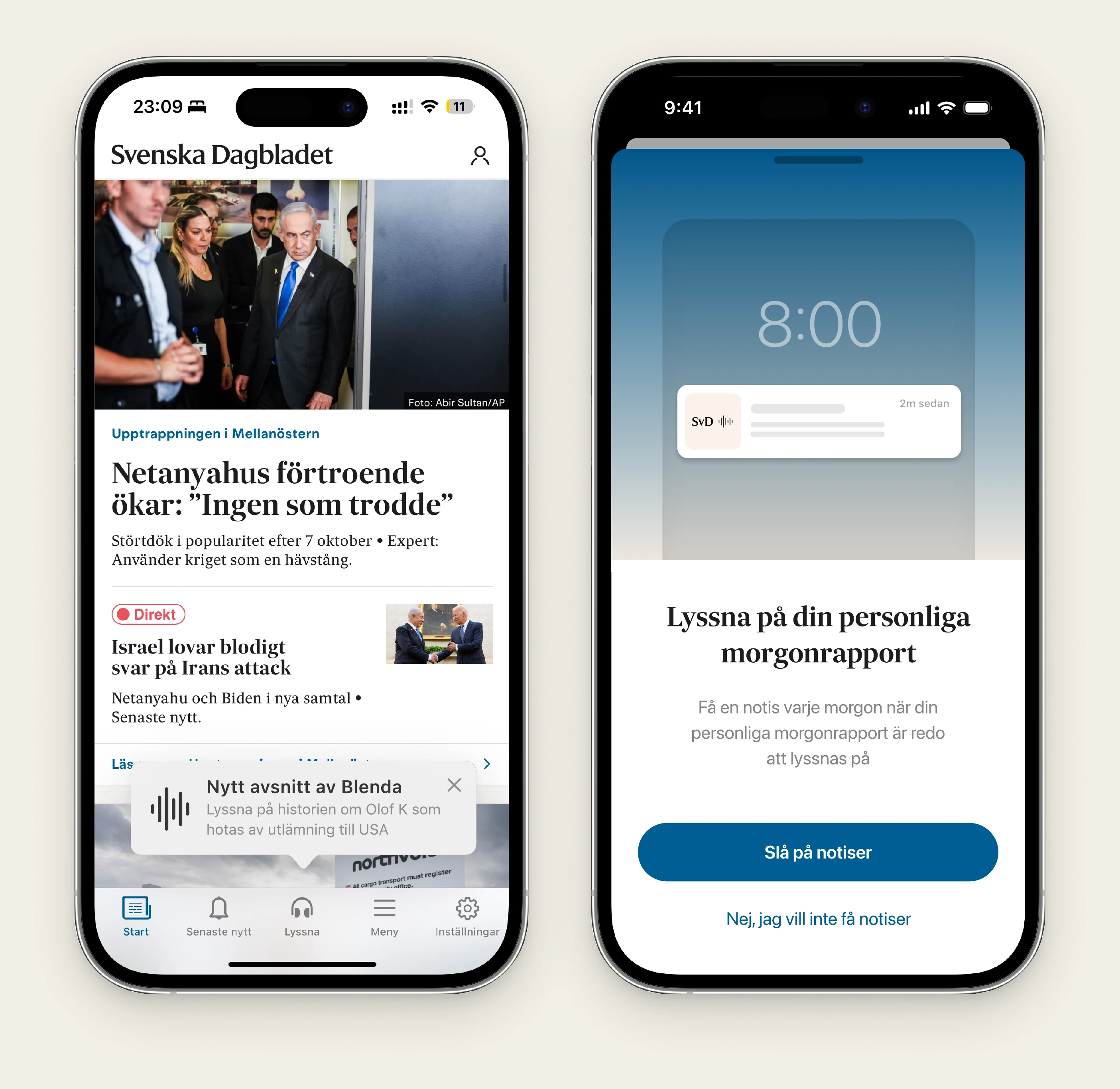
Give users personalized guidance for new podcast releases with Apple tipkit.
Show an overlay explaining the benefits of turning on notifications, aimed at users who might be interested in receiving a morning brief.
Subtle yet easily accessible text-to-speech for those who prefer listening before reading.
This project aimed to improve retention by designing a reactivation experience that welcomes users back with tailored content
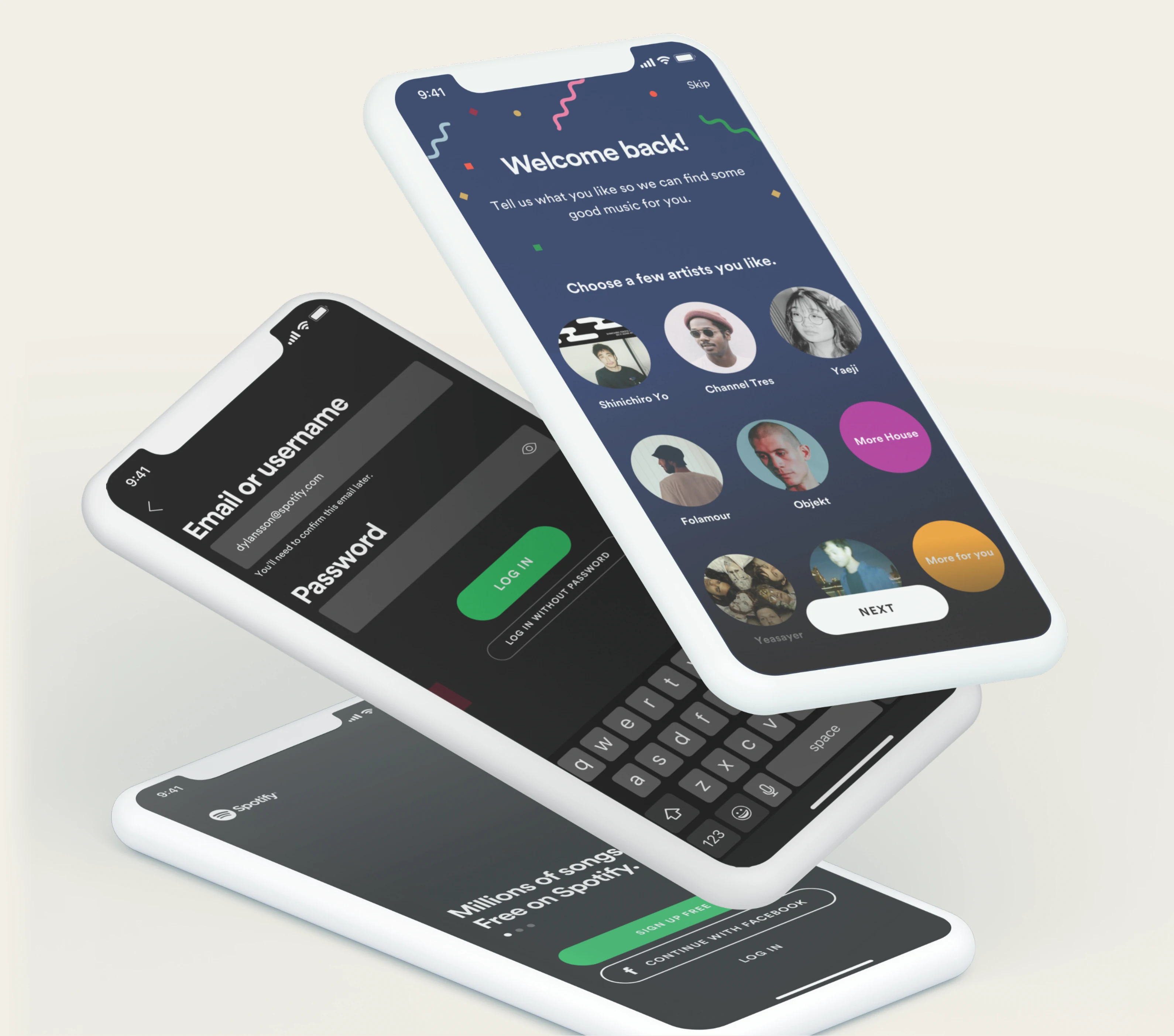
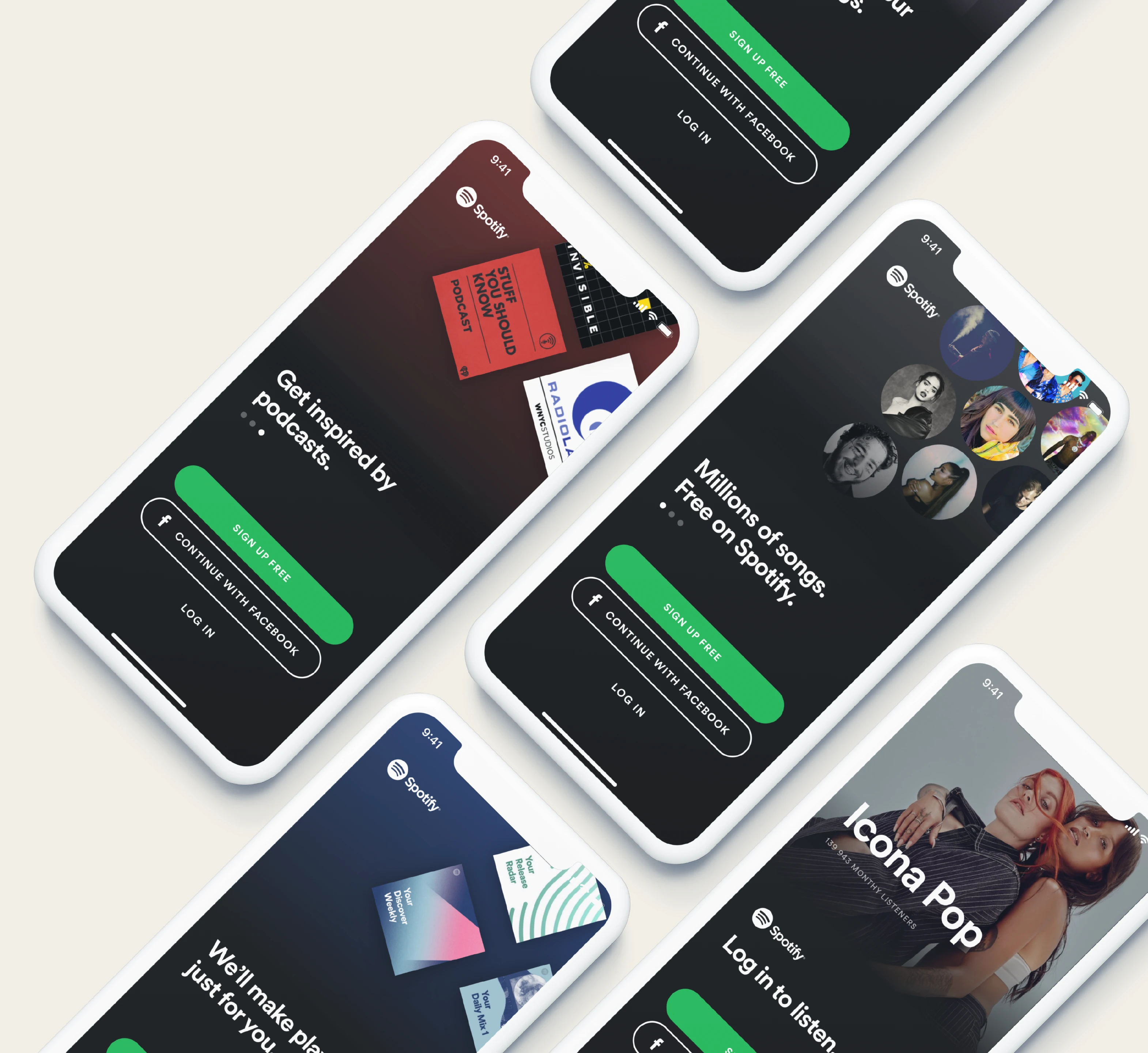
New visual and strategic concepts for the mobile app’s start screen, aligning with Spotify’s brand refresh. I worked on motion design elements to create fluid animations that enhance user interaction and showcase multiple value propositions effectively.
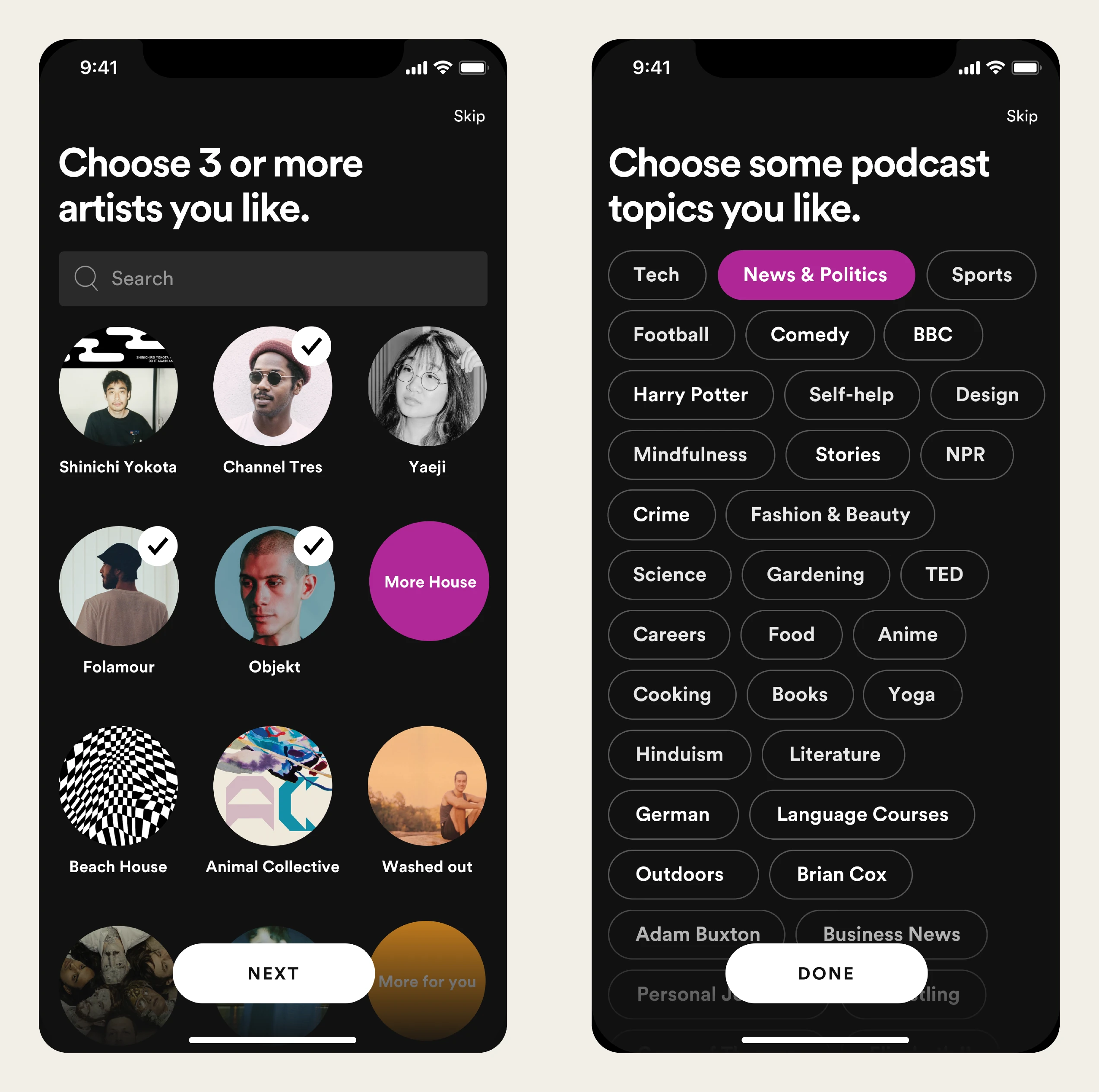
Through extensive concept development, visual design, and motion design, I designed an intuitive system that guides users in selecting their preferred genres and topics, leading to a more personalized content feed.
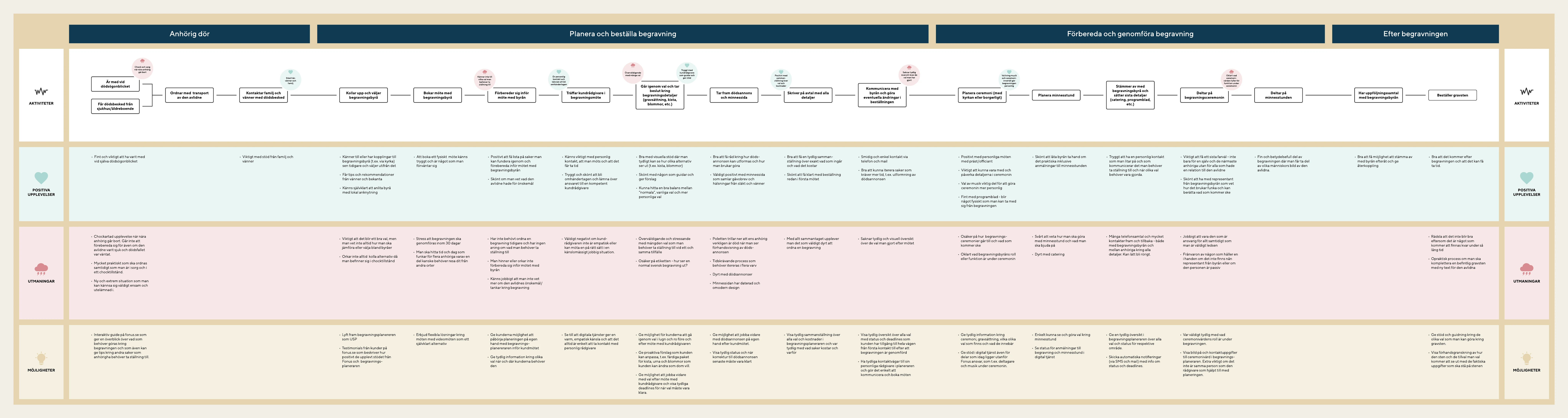
Based on in-depth interviews with people who had recently planned a funeral, I created this user journey to help both our team and Fonus better understand the kind of product we needed to build.
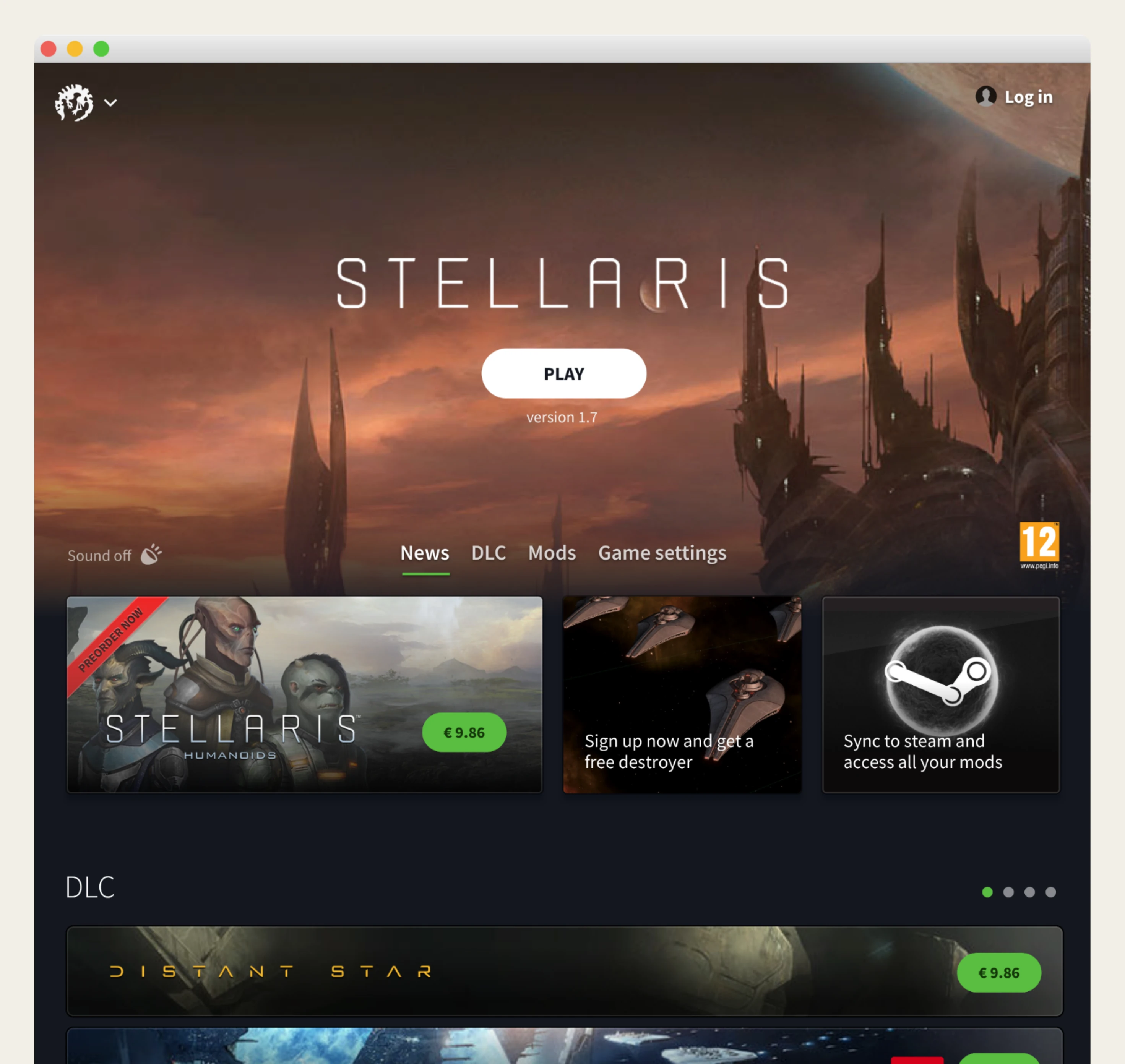
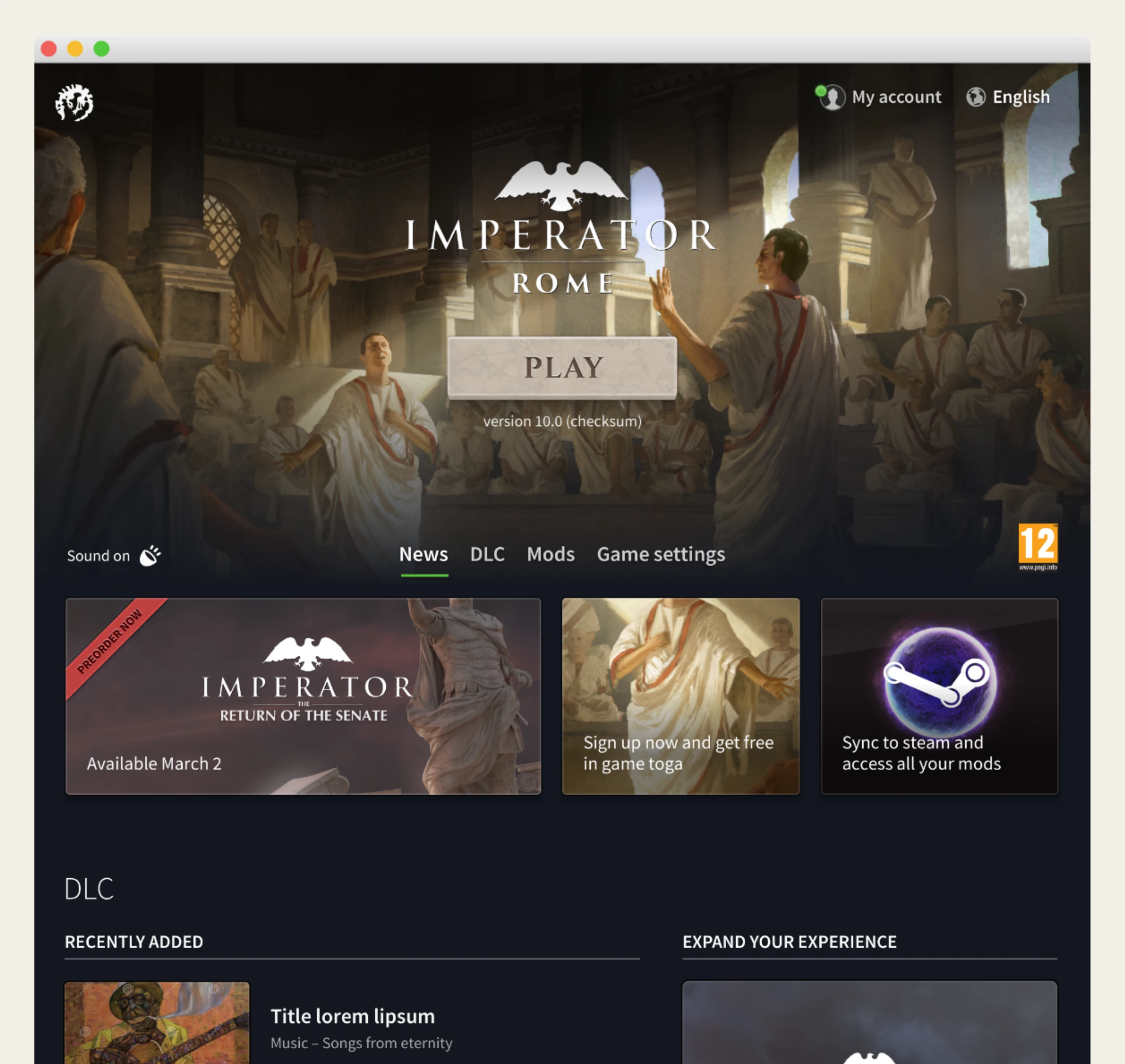
A Windows, macOS, and Linux application with a dynamic design that adapts based on the game the user is launching.
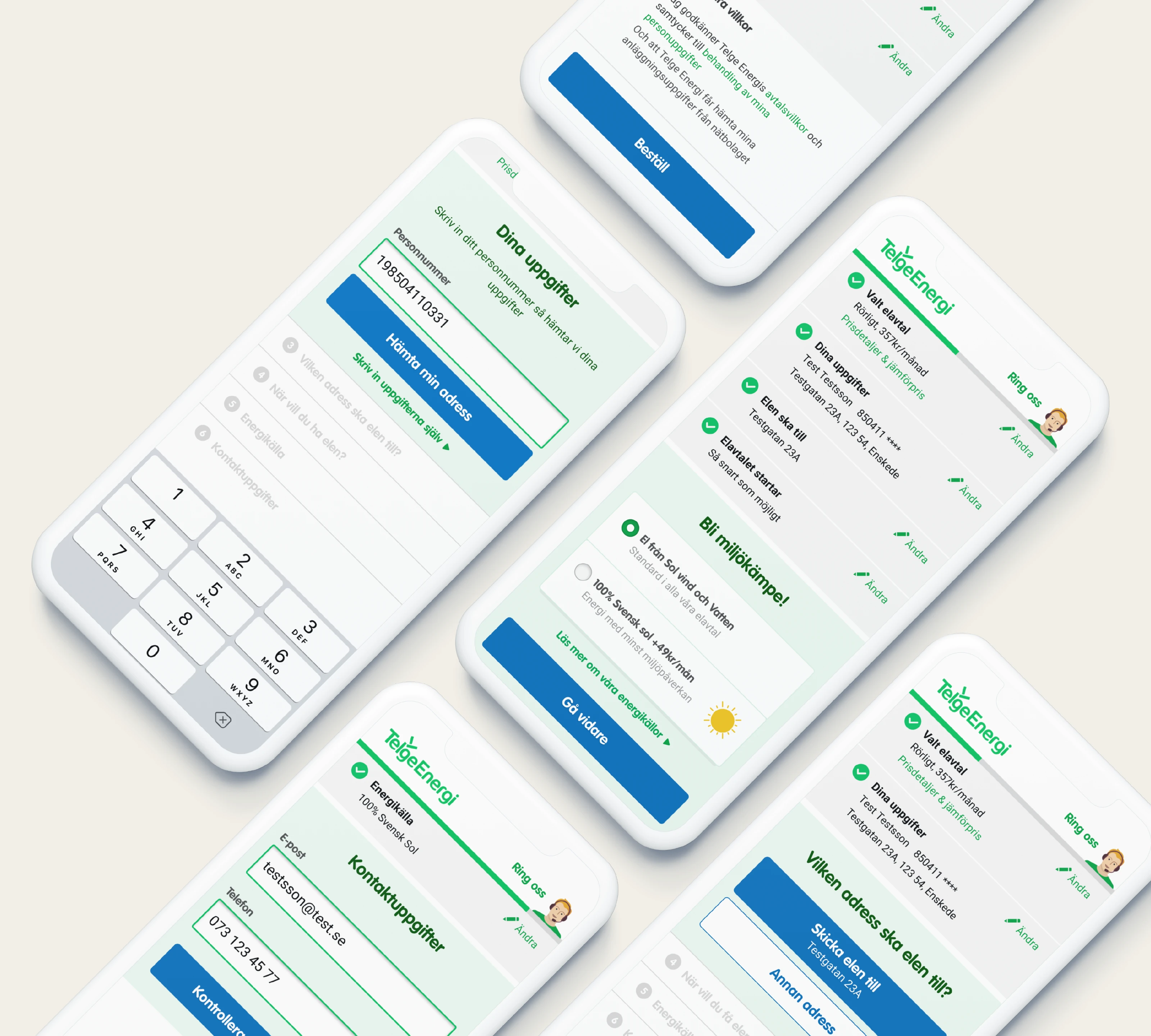
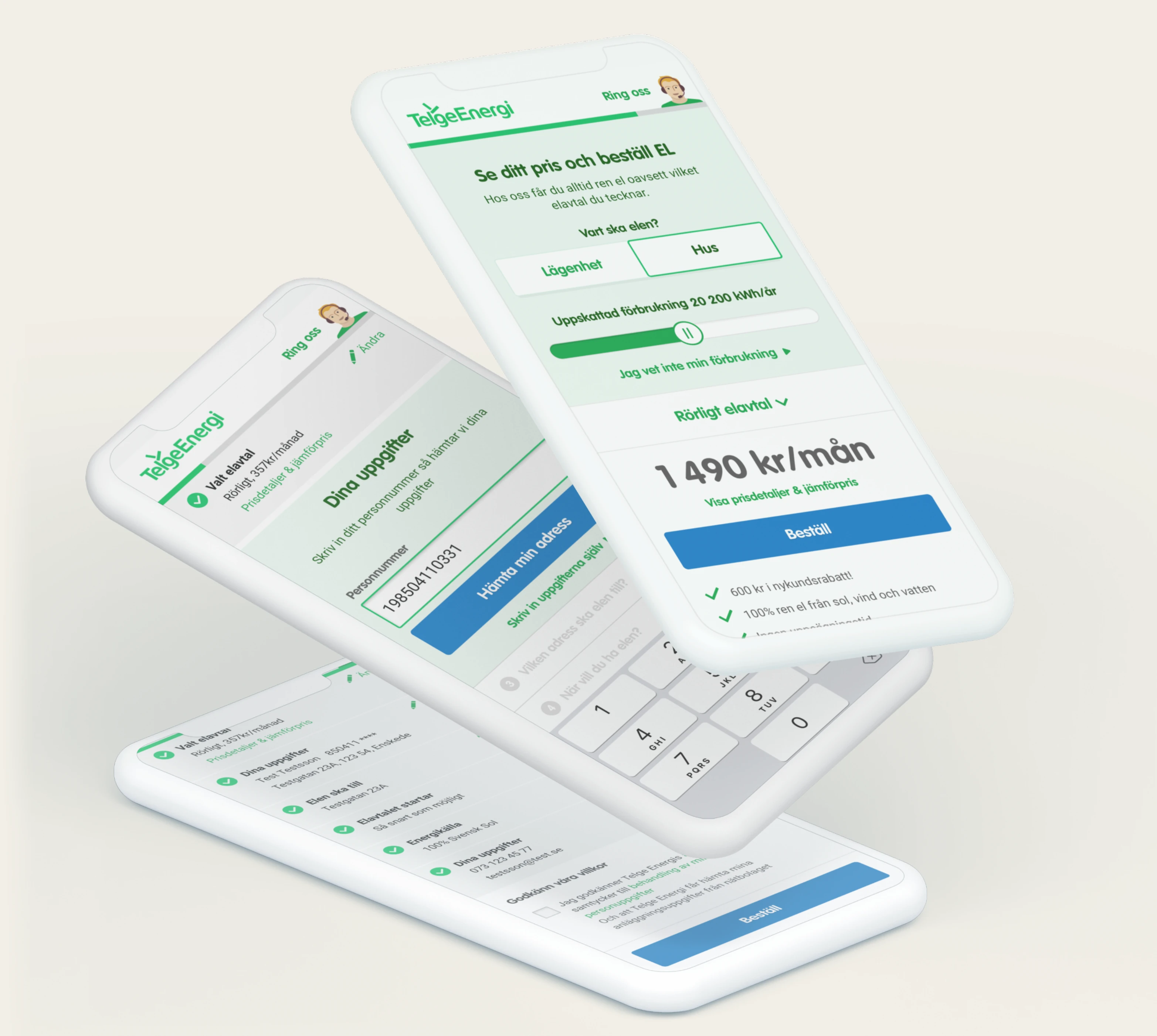
The primary objective was to create a smooth and transparent user journey that instills confidence in users when selecting energy plans. The design was optimized for mobile-first interaction, ensuring accessibility and ease of use across different devices.
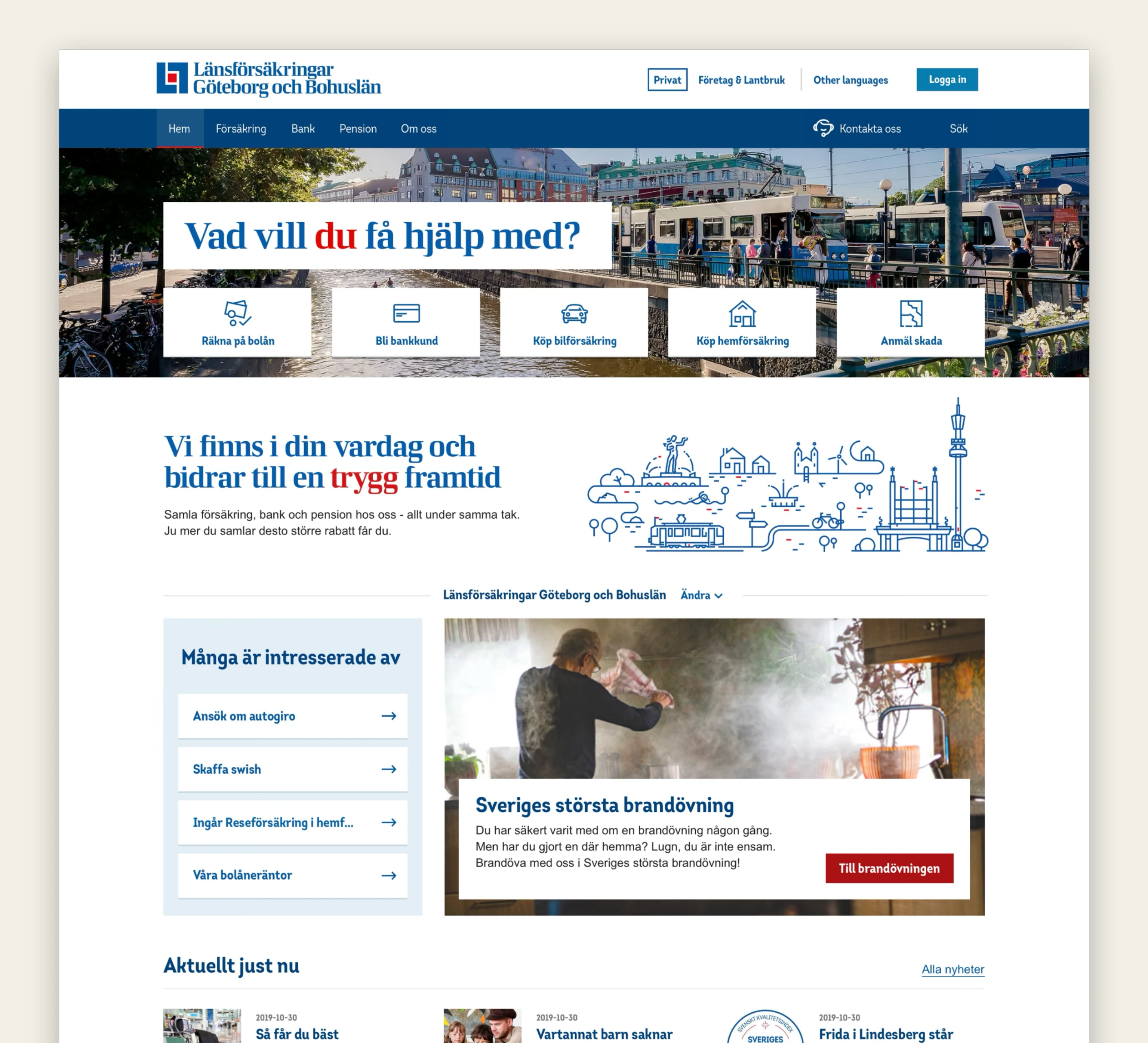
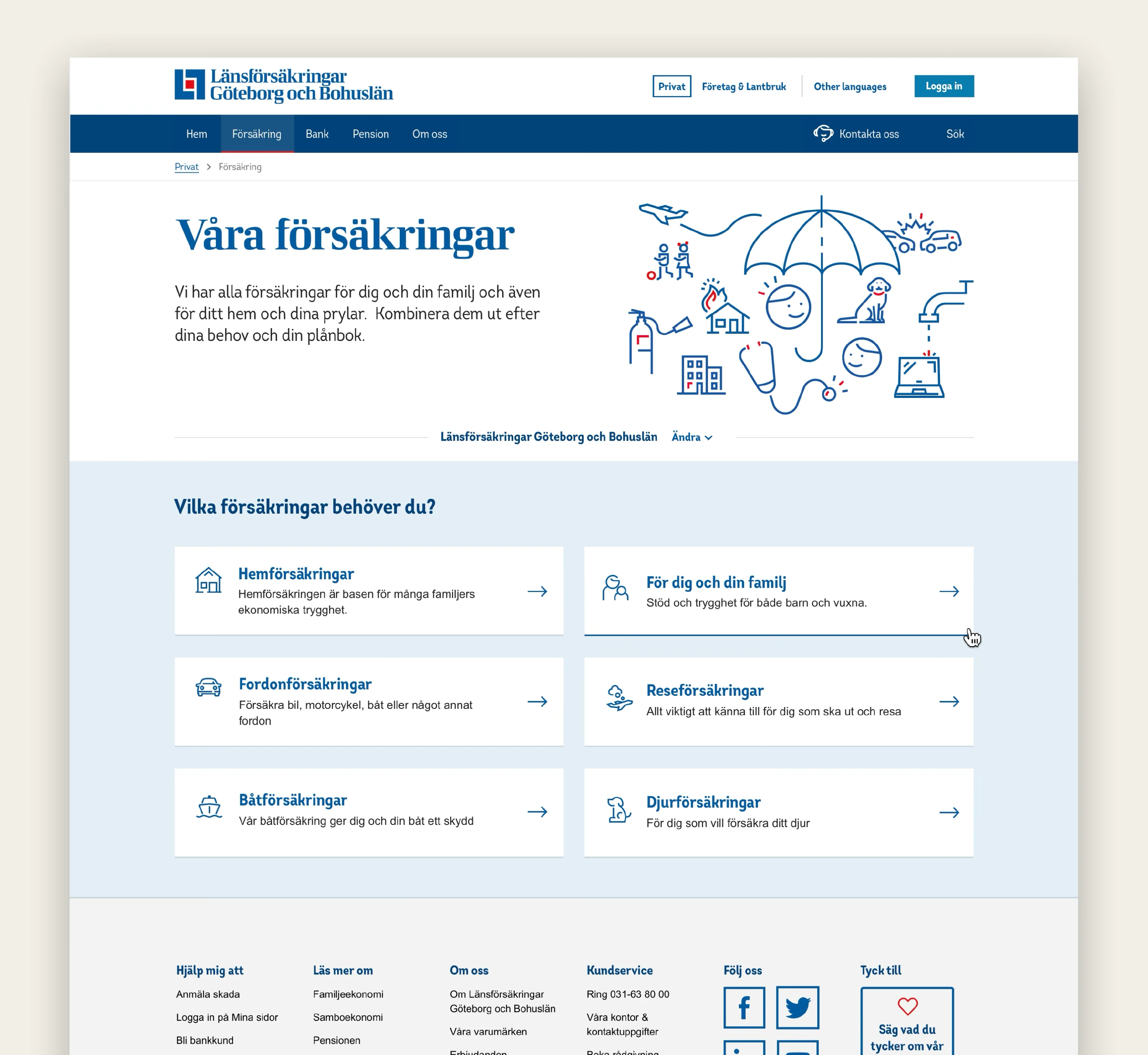
The project involved refining the overall design system, ensuring consistency across digital touchpoints, and developing illustrations to support brand communication.
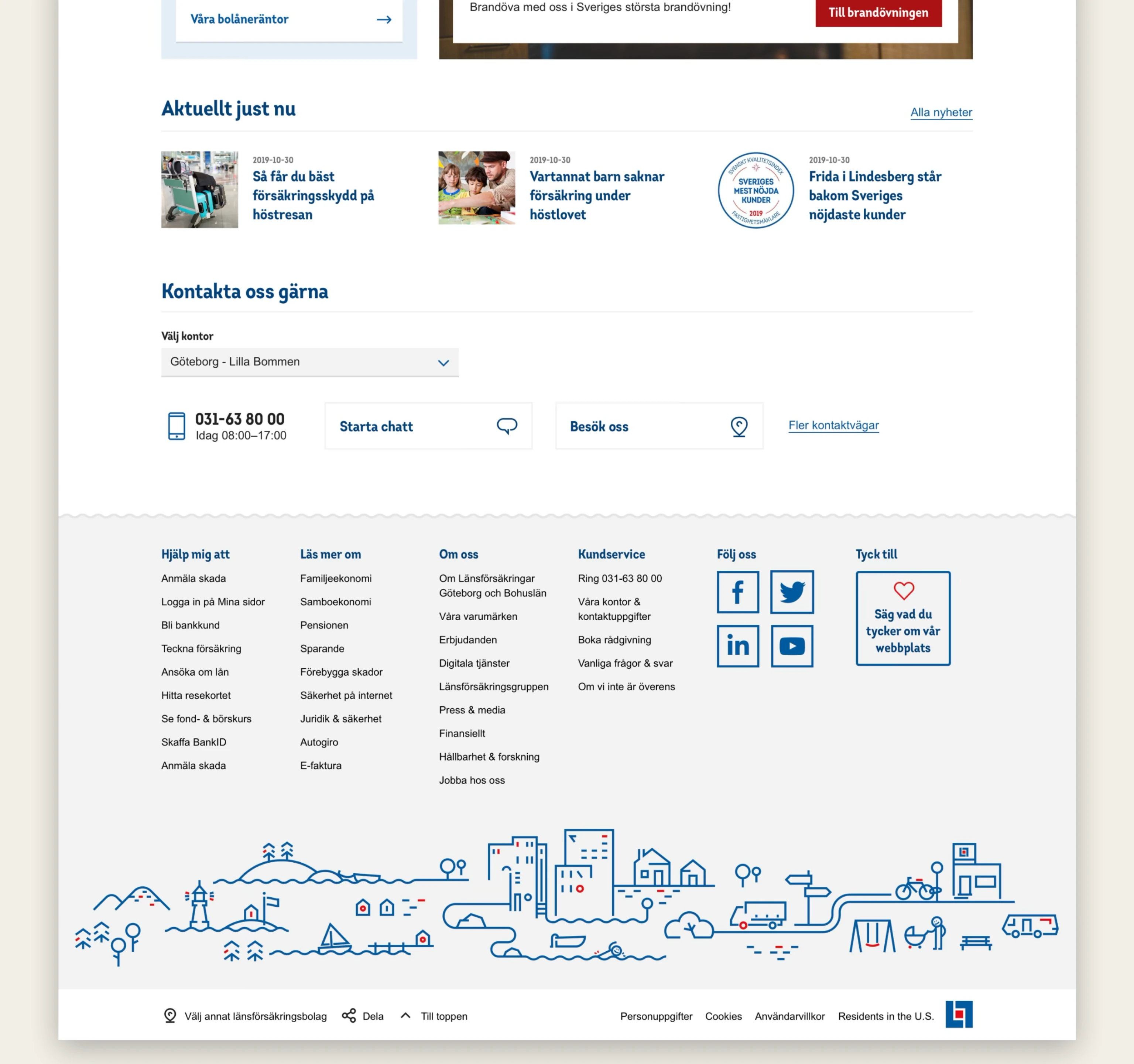
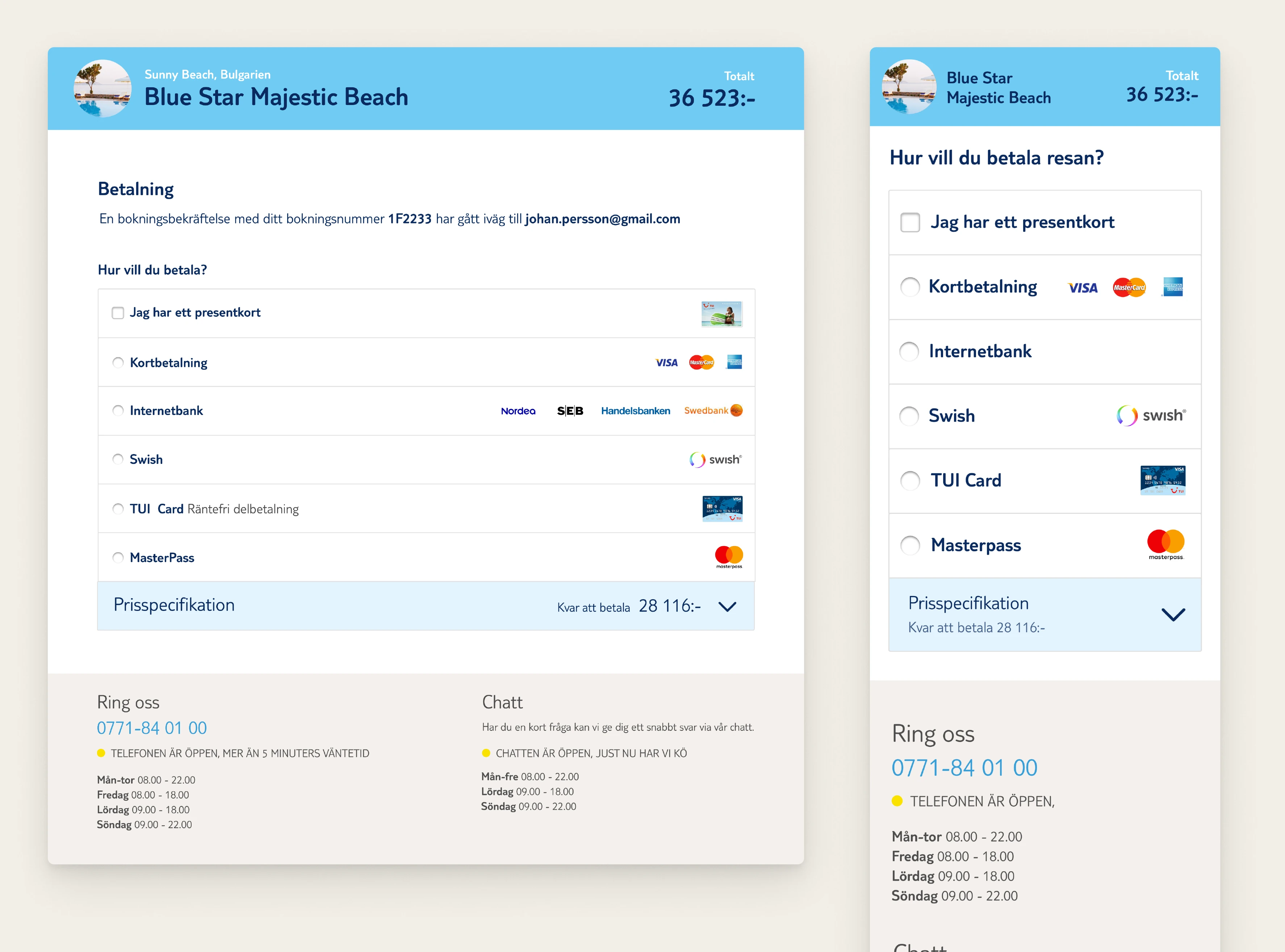
I led the design of the full booking and payment flow—from early discovery to final implementation.
The project ran for over a year and involved research, prototyping, continuous testing, and final visual design.
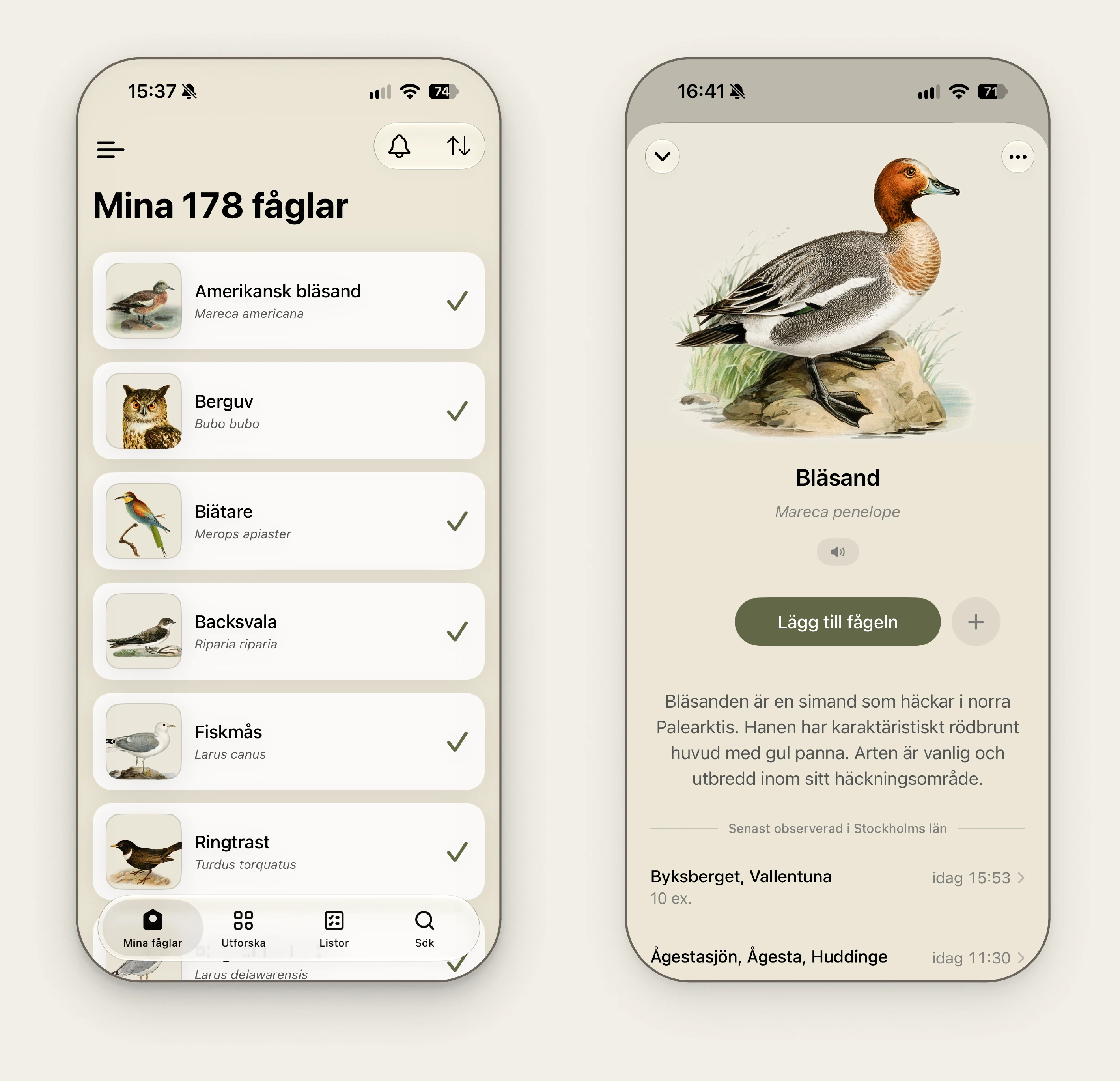
In spring 2026, I wanted to find out how far I could take a native app on my own.
With Claude as my development partner, I designed and built Mina fåglar from scratch: an iOS/Android app for keeping track of the birds you've seen.
It's connected to SLU Artportalen, so it alerts you when rare birds turn up and shows where and when species are being seen across Sweden.